Posts

Module 2: Debugging and Error Handling

Image
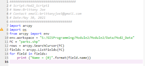
 This week we learned about the types of errors in scripting and how we can utilize the debugging tool in Spyder to fix those errors. Additionally, we learned about try-except statements that allow us to run a script with exceptions.  The first thing to note about errors in a script is the color separation that identifies errors in the console. Red is commonly used to identify errors. An example of what is identified as an error is a syntax error with a ^ position symbol ( this doesn't mean it is where the location of the error).  Script 1  To get the results for this script, we had to fix the FC that was misspelled. I also had to update the file path and recognizing the correct function was used and entered correctly.  Script 2 For the second script, we were tasked to correct the script's errors. By making changes into the file path to update and correct any spelling of the files. Additionally, correct small details of assigned features and were carried over in...

Fundamentals in Python

Image
  Flowchart Working with Spyder was a challenge. I had started on step 1 on a different approach than the lab instructions gave. My First Attempt started as follows stringName = “Brittany Anne Joe”  nameList – (“Brittany” “Anne” “Joe”)  print (“Joe”)  Although this gave the same results of printing my last name Joe in the program I learned to use some of Python’s functions that allows me to print my last name from a list. stringName.split automatically takes your stringName feature and divide it into separate cars for “Brittany” “Anne” “Joe”. To specify what to print from a list you need to index by specifying the number that represents your list. So “Brittany” would be 0, “Anne “would be 1, and “Joe” was 2.  After step 1, we had to debug a prewritten code that generates the results of random wins and losses for the players. I was challenged to create a loop to generate 20 random numbers between 0-10. My unlucky value was number 5 and we had to use an if/else st...

Module 7: Introduction to Google Earth Tours and KML Files

Image
 What are Google Earth and Google Earth Tours?  Google Earth is an interactive program that mimics a 3D representation of the Earth and its features based on satellite imagery. Google Earth Tours allows you to record the location that you marked and move around to provide users a visual showcase of the area or specific features. This application is useful for visual reference to present satellite imagery and give tours on multiple locations.  What are KML files?  In our lab module, we learned about transferring layer data from ArcPro into a KML file so that GIS data can be presented in Google Earth software. In order to transfer layer information into KML files, we used the Layer to KML conversion tool in Spatial Analysis to create the KML file.  Additionally, we input a legend image into Google Earth and organized all Google Earth features into proper folders to better direct the Google Earth Tour. 

Module 6: Isarithmic Mapping

Image
 What are Isarithmic maps?  An Isarithmic map showcases continuous surfaces using isolines. An example of this is presenting precipitation levels. Contours are used in logarithmic maps to connect the location of equal values.  Lab Description In the lab, we designed an Isartihmic map of Average Annual Precipitation in the State of Washington over 30 years. We obtained the raster data through the USDA Geospatial Gateway. The data was published by the U.S Department of Agriculture, Natural Resources Conservation Service, and National GEospatial Management Center from September 2012. The data originated from the PRISM Group at Oregon State University.  How was the precipitation data derived and interpolated?  The precipitation data was derived and interpolated by PRISM (Parameter-elevation Relationships on Independent Slopes Model) that accounts for physiographic factors influencing climate patterns. DEM (Digital Elevation Model) is calculated in the data between t...

Module 5: Choropleth and Proportional Mapping

Image
 This week's assignment challenges us to explore data sets and using graduated and proportional symbology to present data. Graduated symbology utilizes classified data that shows the quantitative differences between data in which data is classified in ranges and a different sized symbol represents that range. Proportional symbology uses unclassified data to represent values in a field using the attribute value.  One challenge in this week's lab was working on the symbology by inputting a picture symbol into the mapping project. Another challenge to the week's lab is adjusting the European country's labels. Due to the close proximity of some countries or the size of the country the label wouldn't fit inside. Many adjustments were made, but there can be further improvements in future projects. 

Module 4: Classification Methods

Image
 Understanding Data Classification  In this week's lab, there are four common data classification methods that are used to present data; Equal Interval, Quantile, Standard Deviation, and Natural Break (Jenks ) .  Our lab allowed us to explore the different types of data classification and visualize how each classification is different from the other. We used data from Florida Geographic Database Library 2010 Census Data of people in Dale County, FL to find the percentage of individuals over 65. There are two maps, one on Classification Methods for Senior Population over 65 and another Classification Methods for Senior Population over 65 per Sq. Mile.  Observations: Natural Break (Jenks ) Classification - Considers natural groups within the data. It minimizes extreme values between data values in the same class and maximizes differences between classes. Using the Natural Break Classification would use the natural grouping of the data to replicate how populations of p...

Module 3: Cartographic Design

Image
 Gestalt's Principles   In our week's lesson, we learned about Gestalt's Principles covers cartographic design techniques that allows the audience to better understand a map. Few points about cartographic design and how gestalt's principles apply to map design is understanding the four techniques to display data.  Visual Heirachy Using symbols and ranking methodology to highlight data importance or where you want your audience to focus on in map. You can make single symbols different sizes to represent different classes or highlight their value on the map compared to other data such as population maps.  Contrast  Contrast focuses on differences between map features such as adjustments to size, color, or shape. Sometimes certain color choices such as blues and reds are great for highway and interstates. It can be helpful with a neutral background.  Balance  Balance is the organization of all map elements that fills the space granted for the map pro...